Understanding White Balance: A Complete Guide
Learn how white balance affects your photos, when to use presets vs custom settings, and how to master the Kelvin scale for accurate colors.
White balance is one of the most misunderstood camera settings. Many photographers leave it on auto and hope for the best. While auto white balance has improved dramatically, understanding how to control color temperature gives you the power to produce accurate colors in any lighting and use creative color shifts intentionally.
What Is White Balance?
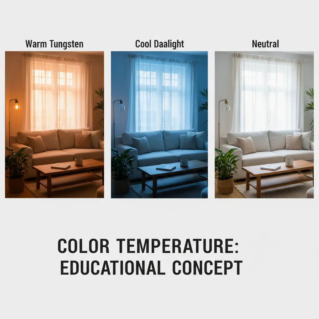
Every light source has a color temperature. The warm glow of a candle is very different from the cool blue of open shade on a sunny day. Your eyes and brain adapt automatically, so a white sheet of paper looks white whether you see it under tungsten bulbs or daylight.
Your camera does not adapt the same way. It needs to be told what kind of light it is working with so it can compensate and render neutral tones correctly. That compensation is white balance.
When white balance is set correctly, whites appear white, grays appear neutral, and all other colors are rendered accurately. When it is wrong, the entire image takes on an unnatural color cast: too orange, too blue, or sometimes too green.
The Kelvin Scale Explained
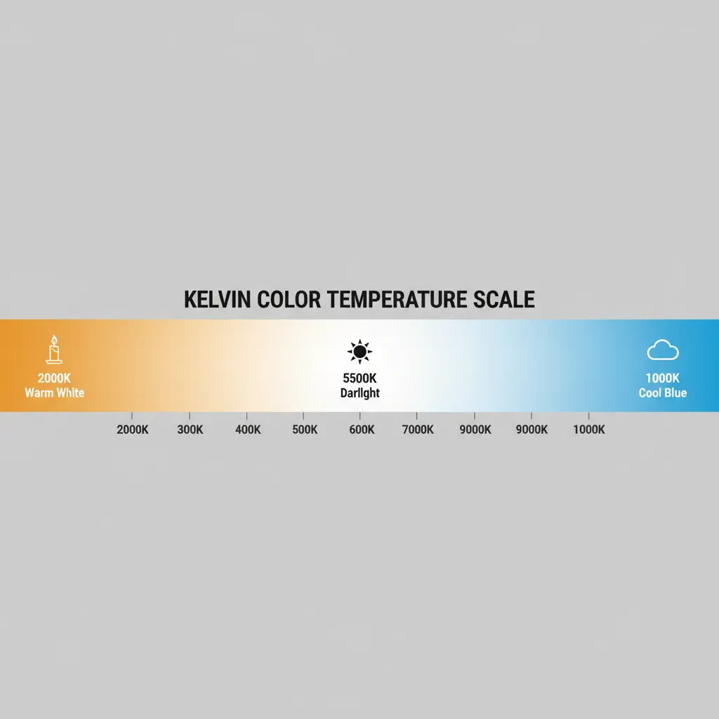
Color temperature is measured in Kelvin (K). Counterintuitively, lower numbers represent warmer (more orange) light and higher numbers represent cooler (more blue) light. The way your camera interprets this data is also influenced by its sensor — our guide on camera sensor sizes explained covers how different sensors handle color and light differently.
Here are common light sources and their approximate Kelvin values:
| Light Source | Kelvin (K) |
|---|---|
| Candlelight | 1,800 - 2,000 K |
| Tungsten bulbs | 2,700 - 3,200 K |
| Sunrise / sunset | 3,000 - 3,500 K |
| Midday sunlight | 5,200 - 5,500 K |
| Overcast sky | 6,000 - 7,000 K |
| Open shade | 7,000 - 8,000 K |
| Heavy overcast / twilight | 8,000 - 10,000 K |
When you set your camera to a specific Kelvin value, you are telling it what the ambient light temperature is. The camera then adds the opposite color to compensate. Setting 3,200K tells the camera the light is warm tungsten, so it adds blue to neutralize it.
Camera White Balance Presets
Every camera includes white balance presets designed for common lighting situations. These are reliable starting points.
Daylight (approximately 5,200K)
Use in direct sunlight during the middle of the day. This is the baseline that most other settings are compared against.
Cloudy (approximately 6,000K)
Adds slight warmth to counteract the cool, blue-tinted light of overcast conditions. Also works well during golden hour if you want to enhance the warmth.
Shade (approximately 7,000K)
Open shade is significantly bluer than direct sun. This preset adds noticeable warmth. Useful when photographing in the shadow of buildings or under tree canopy on a sunny day.
Tungsten (approximately 3,200K)
Designed for traditional incandescent light bulbs. Adds strong blue tones to counteract the orange cast. If used outdoors by mistake, your images will look extremely blue.
Fluorescent (approximately 4,000K)
Fluorescent lights have an unusual spectral output that often includes green. This preset compensates with a slight magenta shift in addition to adjusting color temperature.
Flash (approximately 5,500K)
Camera flashes and studio strobes produce light close to daylight color temperature. This preset is similar to Daylight but slightly warmer to account for the specific output of flash units.
Auto White Balance: When It Works and When It Fails
Auto white balance (AWB) analyzes the scene and makes its best guess at the correct color temperature. Modern cameras are remarkably good at this, especially in daylight and mixed conditions.
AWB struggles in these situations:
- Scenes dominated by one color. A field of green grass or a red brick wall can confuse the algorithm. It may try to neutralize the dominant color, shifting the overall balance incorrectly.
- Warm artificial light. AWB often overcorrects tungsten lighting, removing too much warmth and making scenes look sterile when they should feel cozy.
- Mixed lighting. A room with both daylight from windows and tungsten overhead lights has two different color temperatures. AWB picks a compromise that satisfies neither.
- Consistency across a series. AWB may choose slightly different values for each frame. This is a problem when you need matching colors across a set of images, such as product photography or event coverage.
Custom White Balance
For the most accurate results, set a custom white balance using a gray card or white balance card.
How to Set Custom White Balance
- Place a neutral gray card in the same light as your subject.
- Fill the frame with the gray card and take a photo.
- Go to your camera’s white balance menu and select “Custom” or “PRE” (varies by brand).
- Select the gray card image as the reference.
- The camera now uses this measurement for all subsequent shots until you change it.
This method is especially valuable for studio work, product photography, food photography, and any situation where color accuracy is critical.
Shooting in Kelvin Mode
Setting a specific Kelvin value gives you the most direct control. Instead of relying on presets or auto, you dial in exactly the color temperature you want.
How to Use Kelvin Mode
- Switch your white balance to “K” or “Color Temperature” in the menu.
- Use the control dial to set a value.
- Take a test shot and review on the LCD.
- Adjust up (warmer) or down (cooler) until the colors look right.
With practice, you can estimate the correct Kelvin for any scene. Start with 5,500K for daylight, adjust down for artificial light, and adjust up for shade or overcast conditions.
Creative White Balance
White balance does not always need to be “correct.” Intentionally shifting color temperature is a powerful creative tool.
Warm Shifts for Mood
Setting your Kelvin value higher than the actual light temperature adds warmth. Shooting a sunset at 7,000K or 8,000K intensifies the golden and amber tones. For complete guidance on capturing those vivid skies, see our guide on how to photograph sunsets like a pro. This works beautifully for golden hour portraits and autumn landscapes.
Cool Shifts for Atmosphere
Setting your Kelvin value lower than the actual light temperature adds blue tones. This is effective for moody blue hour cityscapes, winter scenes, and creating a sense of cold or isolation.
Cross-Processing Effects
Combining unusual white balance settings with specific lighting can produce color effects reminiscent of cross-processed film. Shooting tungsten-lit scenes with the Daylight preset produces deep blue tones. Shooting daylight scenes with the Tungsten preset creates an extreme cold look.
White Balance and RAW Files
If you shoot in RAW format, white balance is stored as metadata rather than baked into the image data. This means you can change the white balance completely in post-processing with zero quality loss.
This is one of the strongest arguments for shooting RAW — learn more about the trade-offs in our RAW vs JPEG guide. Made a white balance mistake? Set the wrong Kelvin value? No problem. Open the file in Lightroom, Capture One, or any RAW processor and adjust the color temperature slider to any value you want.
However, this does not mean you should ignore white balance when shooting RAW. Setting accurate white balance in-camera gives you a better preview on the LCD, helps you evaluate exposure more accurately, and saves time in post-processing.
White Balance for Video
Video shooters need to pay extra attention to white balance because correcting color in video post-production is more complex and time-consuming than with still photos.
Set a manual Kelvin value or custom white balance before recording. Shooting in manual mode with a locked Kelvin value prevents the camera from recalculating mid-clip. Auto white balance during video recording can cause visible color shifts as the camera recalculates, which looks unprofessional.
Recommended Camera Settings Table
Here are specific white balance settings for common real-world shooting situations, including camera-specific notes:
| Scenario | Kelvin Value | Preset Alternative | Tint Adjustment | Notes |
|---|---|---|---|---|
| Outdoor portrait, midday sun | 5,200 – 5,500K | Daylight | Neutral | Baseline for most outdoor shooting |
| Golden hour portrait | 6,500 – 7,500K | Cloudy or Shade | Neutral | Higher K enhances warmth intentionally |
| Indoor window light, white walls | 5,000 – 5,500K | Daylight | Neutral | Test and adjust; reflections from colored walls can shift tint |
| Indoor tungsten bulbs | 2,800 – 3,200K | Tungsten / Incandescent | Neutral | Overshoot toward 2,800K if bulbs are warm-toned LEDs |
| Office fluorescent lights | 3,800 – 4,200K | Fluorescent | +5 to +10 magenta | Fluorescents emit green; add magenta to compensate |
| Mixed light (window + tungsten) | 4,200 – 4,800K | Custom WB with gray card | Varies | No single setting is perfect; use custom WB or shoot RAW |
| Night cityscape | 3,500 – 4,000K | Tungsten | Neutral | Cooler values preserve the blue-hour atmosphere |
| Studio flash (Profoto, Godox) | 5,400 – 5,600K | Flash | Neutral | Most strobes output near 5,500K; some speed lights drift warmer at low power |
Real-World Tips from Experienced Photographers
Learn to read color by eye. After enough practice, you can walk into any room and estimate the Kelvin value within 500K. Start by always shooting in Kelvin mode rather than presets. Over weeks of conscious adjustment, you build an intuitive sense for how light looks at different color temperatures. This skill saves time and reduces reliance on auto white balance, especially in fast-paced environments like weddings and events.
Watch for mixed lighting traps. A common scenario at indoor events is daylight streaming through windows (5,500K) combined with overhead tungsten fixtures (3,000K). No single white balance setting can correct both simultaneously. Experienced photographers handle this by either gelling their flash to match the ambient light (adding a CTO gel to convert flash to tungsten), or by positioning subjects in areas where one light source dominates. If you shoot RAW, you can also use local white balance adjustments in Lightroom or Capture One to correct different areas of the frame independently.
The gray card test saves hours in post. Before a studio session or product shoot, take a single frame of an 18% gray card (such as the X-Rite ColorChecker Passport or a simple Lastolite gray card) under your working lights. In Lightroom, use the white balance eyedropper on the gray card image, then sync that setting to the entire series. This guarantees consistent, accurate color across hundreds of images with zero guesswork. Professional product photographers and catalog shooters consider this step non-negotiable.
Skin tones are the ultimate test. When evaluating white balance for portraits, ignore the background and focus on skin. Skin tones should look natural and warm without appearing orange, pink, or gray. On cameras like the Fujifilm X-T5, the built-in “Skin Color” white balance priority mode is specifically designed to protect skin tones. On other cameras, setting Kelvin manually between 5,200K and 5,800K in daylight typically produces the most flattering skin rendering.
Quick Reference Settings
Here is a practical cheat sheet for common scenarios:
- Outdoor daylight portraits: 5,500K or Daylight preset
- Golden hour: 6,500K to 7,500K for enhanced warmth
- Indoor with window light: 5,000K to 5,500K
- Indoor with tungsten bulbs: 3,200K or Tungsten preset
- Overcast day: 6,200K or Cloudy preset
- Shade: 7,000K or Shade preset
- Studio flash: 5,500K or Flash preset
Once you have mastered white balance, combine it with solid photo editing skills in Lightroom to fine-tune colors in post-processing. Understanding white balance transforms your color control from guesswork to precision. Whether you want clinically accurate colors for product shots or a warm, dreamy tone for a portrait, the tools are the same. Learn the Kelvin scale, practice with manual settings, and you will never be surprised by color casts again.
Frequently Asked Questions
What white balance setting should I use for indoor photos? For indoor photos under standard incandescent or warm LED bulbs, set your white balance to approximately 2,800K to 3,200K, or use the Tungsten preset. For rooms lit by daylight from windows, use 5,000K to 5,500K. In mixed lighting situations where both tungsten bulbs and window light are present, shoot in RAW format and set a compromise value around 4,200K to 4,800K, then fine-tune in post-processing. For the most accurate results in any indoor environment, use a gray card to set a custom white balance before your shoot.
Does white balance matter if I shoot RAW? White balance is fully adjustable in RAW files with zero quality loss, so a “wrong” setting in-camera will not permanently damage your image. However, setting accurate white balance while shooting still matters for three practical reasons. First, the camera LCD preview uses the white balance setting, so inaccurate white balance makes it harder to judge exposure and color on set. Second, accurate in-camera white balance reduces post-processing time, especially when working with hundreds of images. Third, if you need to deliver JPEG files straight from the camera (common in sports and news photography), the in-camera white balance is baked into the file and cannot be changed later.
How do I fix white balance in post-processing? In Adobe Lightroom or Camera Raw, open your RAW file and use the Temperature slider (blue to yellow) and Tint slider (green to magenta) in the Basic panel. The fastest method is to click the white balance eyedropper tool and click on something that should be neutral gray or white in the image. Lightroom automatically calculates the correct temperature and tint. For batch correction, adjust one image, then select all images from the same lighting setup and click “Sync Settings” with only the white balance checkbox selected. In Capture One, the process is similar using the White Balance tool in the Color tab.
You might also like
How to Use the Histogram in Photography
Master histogram reading to nail exposure every time. Learn about clipping warnings, expose to the right, and practical histogram use in the field.
How to Use Manual Mode on Your Camera
Understand manual mode with clear explanations of aperture, shutter speed, and ISO, plus practice exercises to build confidence.
How to Photograph Pets and Animals Like a Pro
Get sharp, expressive pet photos with tips on eye-level shooting, burst mode, lighting, action shots, and patience techniques.