Beginner Guide to Photo Composition
Learn advanced composition concepts like visual weight, negative space, depth, patterns, and foreground interest to elevate your photography.
You know the rule of thirds. You have heard about leading lines. For a comprehensive overview of those fundamentals and more, see our article on composition rules every photographer should know. Now it is time to go deeper. Photo composition is not just about where to place your subject — it is about understanding why certain arrangements feel right and others feel awkward. This guide explores the concepts that separate intentional compositions from lucky ones.
Visual Weight: The Hidden Force in Your Frame
Every element in a photograph carries visual weight — the degree to which it attracts the viewer’s eye. Understanding visual weight lets you create balanced or deliberately unbalanced images.
What Makes an Element Heavier?
- Size. Larger objects carry more visual weight than smaller ones.
- Brightness. Bright areas attract the eye before dark areas. A small highlight in a dark scene pulls significant attention.
- Color saturation. A vivid red object stands out against muted surroundings.
- Contrast. High-contrast elements (a dark figure against a light wall) weigh more than low-contrast ones.
- Detail and texture. Complex, detailed areas draw the eye more than smooth, simple areas.
- Human faces and eyes. We are biologically wired to notice faces. Even a tiny face in a crowd pulls attention.
- Position. Objects near the edges or corners of the frame feel heavier than objects near the center.
Balancing Visual Weight
A balanced composition does not mean symmetrical. You can balance a large, muted object on one side of the frame with a small, vivid object on the other. Imagine a seesaw — a heavy object close to the fulcrum balances a lighter object far from it.
When you look at an image and something feels “off” but you cannot identify why, visual weight is often the culprit. One side of the frame is pulling too much attention while the other feels empty.
Negative Space: The Power of Nothing
Negative space is the empty or unoccupied area surrounding your subject. Many beginners try to fill every corner of the frame. Experienced photographers know that what you leave out is as important as what you include.

How Negative Space Strengthens an Image
- It simplifies. A clean background eliminates distractions and puts all attention on the subject.
- It creates breathing room. Subjects need space to “look into” or “move into.” A portrait — especially one shot with a dedicated portrait lens — with open space in front of the subject’s gaze feels natural. The same portrait with the subject jammed against the edge feels claustrophobic.
- It conveys emotion. Vast negative space around a small subject evokes isolation, vulnerability, or freedom. The specific emotion depends on the context and tones.
- It improves readability. On websites and social media, images with generous negative space read better at small sizes and adapt well to text overlays.
Practical Tips for Using Negative Space
- Look for plain backgrounds: clear sky, smooth water, blank walls, fog.
- Shoot from a low angle to place your subject against the sky.
- Use a wide-angle lens and step back to include more environment.
- In post-processing, crop to increase the ratio of negative space to subject.
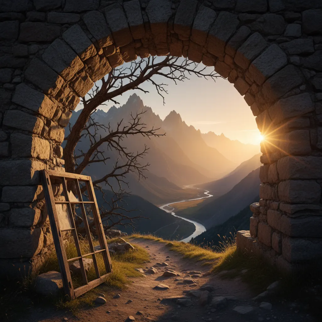
Creating Depth in a Flat Medium
A photograph collapses three dimensions into two. Your job as a composer is to restore that sense of depth.
Overlapping Elements
When one object partially obscures another, the brain interprets it as being in front. Place elements at different distances from the camera and let them overlap to establish depth order.
Size Diminution
Objects appear smaller as they recede into the distance. A row of lamp posts, each smaller than the last, creates a strong depth cue. Wide-angle lenses exaggerate this effect, making nearby objects appear larger and distant ones smaller.
Atmospheric Depth
Haze, fog, dust, and pollution reduce the contrast and saturation of distant objects. This effect is especially beautiful during golden hour photography, when warm light interacts with atmospheric layers. Mountains in the background appear lighter and bluer than those in the foreground. This natural phenomenon — called aerial or atmospheric perspective — is one of the most effective depth cues in landscape photography.
You can enhance atmospheric depth in post-processing by:
- Slightly reducing contrast in distant areas.
- Cooling the white balance of the background.
- Adding a gentle blue tint to shadows.
Tonal Depth
Light areas tend to appear closer while dark areas recede. Use this to create depth: a brightly lit foreground with darker edges and background naturally pushes the viewer’s eye into the center of the image.
Patterns, Repetition, and Rhythm
The human visual system is tuned to detect patterns. Regular, repeating elements create rhythm in an image — a visual beat that the eye follows.
Types of Patterns
- Geometric patterns: Rows of windows, tiled floors, fence posts, columns. Architecture is the richest source.
- Organic patterns: Waves, sand ripples, tree bark, flower petals. Nature creates patterns that are similar but never identical.
- Color patterns: Alternating colors (beach umbrellas, market stalls) create visual rhythm through hue rather than shape.
Breaking the Pattern
A pattern is visually pleasing on its own, but it becomes truly compelling when one element disrupts it. A single yellow door in a row of blue doors. One person looking left when everyone else looks right. Street photography is one of the best genres for practicing pattern-breaking compositions. A wilted flower among fresh blooms.
The disruption becomes the focal point — the subject of the image. The pattern provides context and contrast.
Rhythm and Interval
The spacing between repeated elements matters. Evenly spaced elements create a steady, predictable rhythm. Uneven spacing creates tension or visual acceleration. Think about how a line of trees planted at decreasing intervals leads the eye faster and faster toward the vanishing point.
Foreground Interest
A strong foreground transforms a flat scene into an immersive one, particularly in landscape photography.
Why Foreground Matters
Without a foreground, the viewer stands outside the image, looking at it. With a compelling foreground, the viewer steps into it. The foreground serves as an entry point — the visual doorway into the scene.
What Makes Good Foreground?
- Texture: Rocks, sand, grass, fallen leaves, cracked earth.
- Color: Wildflowers, autumn leaves, colorful stones. Sunset scenes naturally provide rich foreground color when low light rakes across the landscape.
- Leading elements: A path, stream, or fence line that guides the eye from front to back.
- Reflections: Water in the foreground reflecting the sky or mountains creates a mirror that doubles the visual interest. Learn more techniques in our guide on how to photograph reflections creatively.
How to Shoot Foreground
- Get low. The lower your camera position, the more prominent the foreground becomes. Many great landscape images are shot from knee height or lower.
- Use a wide-angle lens. Focal lengths of 14mm to 24mm exaggerate the relationship between near and far, making the foreground feel prominent while keeping the background expansive.
- Aperture of f/8 to f/11. You need enough depth of field to keep both the near foreground and the distant background sharp. If the foreground is very close, focus one-third of the way into the scene (or use hyperfocal distance focusing) to maximize the zone of sharpness.
Juxtaposition: Creating Meaning Through Contrast
Placing contrasting elements together creates visual and conceptual tension.
- Old and new: A crumbling building next to a glass skyscraper.
- Large and small: A massive ship dwarfing a tiny rowboat.
- Natural and man-made: A tree growing through a concrete wall.
- Light and dark: A beam of sunlight cutting through a dark interior. Silhouette photography is the purest form of light-versus-dark juxtaposition.
Juxtaposition tells a story. It invites the viewer to consider the relationship between the two elements and draw their own conclusions.
Simplification: Less Is Almost Always More
The most common composition mistake is including too much. Every element in your frame should serve a purpose — either as the subject, a supporting element, or deliberate negative space. Everything else is a distraction.
How to Simplify
- Move closer. Fill the frame with your subject and eliminate the surroundings.
- Change your angle. A slight shift left, right, up, or down can remove a distracting element from the background.
- Use a longer focal length. Telephoto lenses narrow the field of view, excluding peripheral distractions.
- Open the aperture. A shallow depth of field blurs everything except your subject.
- Wait. Sometimes a person walks out of frame, a cloud covers a distracting element, or the light shifts to isolate your subject naturally.
Ask yourself before every shot: “Is there anything in this frame that does not need to be here?” If the answer is yes, find a way to remove it.
Training Your Eye
Composition improves with practice, but not just any practice — deliberate practice.
- One concept per outing. Spend an entire session focused on negative space, or patterns, or foreground interest. Do not try to apply everything at once.
- Shoot the same subject ten different ways. Walk around it. Get low. Get high. Zoom in. Step back. Include context. Isolate it. This exercise forces you to see composition options you would otherwise miss.
- Study paintings. Photographers did not invent composition — painters refined these principles over centuries. Study how Vermeer used light, how Hokusai composed waves, how Hopper used negative space.
- Review your own work with a critical eye. Two weeks after a shoot, look at your images. Which ones hold your attention? Why? Which ones fall flat? The patterns you find will reveal your strengths and weaknesses.
Composition is a skill, not a talent. Everyone starts by following rules. With enough practice, you will internalize them so deeply that strong composition becomes instinct — something you feel rather than think about. That is the goal.
Recommended Camera Settings for Composition Techniques
Different composition techniques demand different technical settings. This table pairs each concept from this guide with the camera settings that help you execute it effectively.
| Technique | Lens / Focal Length | Aperture | Shutter Speed | Additional Tips |
|---|---|---|---|---|
| Negative space with small subject | 70–200mm (e.g., Sony FE 70-200mm f/2.8 GM II) | f/4–f/5.6 | 1/250s+ | Telephoto isolates the subject within open space |
| Foreground interest landscape | 14–24mm (e.g., Nikon Z 14-24mm f/2.8) | f/8–f/11 | 1/125s or tripod | Focus one-third into the scene for front-to-back sharpness |
| Overlapping depth layers | 24–70mm | f/5.6–f/8 | 1/160s | Medium aperture keeps all layers acceptably sharp |
| Pattern repetition | 100–400mm (e.g., Canon RF 100-400mm f/5.6-8) | f/8 | 1/250s | Long focal length compresses repeating elements |
| Breaking the pattern | 50–100mm | f/2.8–f/4 | 1/200s | Slightly shallow DOF blurs surrounding pattern, emphasizes the break |
| Juxtaposition | 35–50mm | f/5.6–f/8 | 1/125s | Normal perspective preserves natural size relationships |
| Simplification / fill-the-frame | 85–135mm or macro lens | f/2.8 | 1/200s | Shallow DOF and tight framing eliminate all distractions |
On cameras like the Fujifilm X-T5, Sony A6700, or other APS-C bodies, multiply these focal lengths by 1.5x to get the equivalent field of view. A 50mm lens on APS-C frames like a 75mm on full frame, which is excellent for juxtaposition and simplification work.
Real-World Composition Tips from Experienced Photographers
Slow down and look before you shoot. The single biggest difference between amateur and professional compositions is time. Beginners snap quickly and move on. Experienced photographers study the scene, consider multiple angles, and wait for the right light or the right moment. Spending two minutes analyzing a scene before pressing the shutter produces dramatically better results than shooting immediately.
Use your feet before your zoom ring. Physically moving closer, farther, or to the side produces fundamentally different compositions than zooming. Moving changes perspective — the spatial relationship between foreground and background shifts. Zooming merely crops. A photographer standing three meters away with a 35mm lens sees a completely different image than one standing ten meters away and zooming to 105mm, even though the subject appears the same size. The first image has dramatic foreground-background separation; the second compresses everything into a flat plane. Both are valid, but they tell different stories.
Photograph familiar places in unfamiliar conditions. Fog, rain, snow, twilight, and harsh midday sun transform ordinary scenes into extraordinary compositions. A park you walk through every day becomes a completely different subject in dense fog. Returning to the same location in different weather and seasons trains you to see compositional possibilities that changing locations alone does not reveal.
Shoot tight, then step back. Many photographers default to medium-distance shots that include some subject and some environment without committing to either. Try two extremes: fill the frame completely (pure subject, no context), then step way back (subject small in a vast environment). Compare the two. Often one of the extremes is far more compelling than the middle ground.
Analyze failures as carefully as successes. When an image does not work, identify exactly why. Was the background too busy? Was there no clear subject? Was the horizon crooked? Every failure teaches a specific composition lesson. Keep a short note on your phone after each shoot — two or three things you would do differently. Over months, these notes reveal patterns in your weaknesses and give you focused areas to improve.
Common Mistakes to Avoid
Merging the subject with the background. A tree growing out of someone’s head, a lamppost emerging from a building’s roof — these mergers happen when photographers focus only on the subject and ignore what sits directly behind it. Before pressing the shutter, check behind your subject. A half-step to the left or right usually resolves the problem.
Placing the horizon dead center without purpose. A centered horizon splits the image into two equal halves, which feels static and indecisive unless you are deliberately creating symmetry (like a reflection shot). Decide whether the sky or the ground is more interesting, then give two-thirds of the frame to that element.
Shooting only at eye level. Adult eye-level perspective is the most common and therefore the least surprising viewpoint. Get low for drama and power. Get high for context and patterns. Photograph children and pets at their eye level, not yours. The simple act of changing your height transforms ordinary compositions into engaging ones.
Overlooking edges and corners. Bright spots, partial objects, or high-contrast areas at the edges of the frame pull the viewer’s eye out of the image. Scan the borders before you shoot. If something distracting sits at the edge, reframe or plan to crop it in post.
Confusing clutter with complexity. A complex image has multiple elements arranged with intentional relationships — each supporting the overall composition. A cluttered image has multiple elements competing for attention with no hierarchy. The difference is organization. If you cannot identify a clear subject and a clear supporting structure, simplify.
Frequently Asked Questions
What is the single most effective way to improve photo composition quickly? Shoot the same subject from at least five different angles and distances before moving on. This forces you to explore perspectives you would otherwise overlook and trains your eye to evaluate compositions comparatively rather than in isolation. Within a few weeks of this practice, you will start seeing multiple composition options instinctively before raising the camera.
Should I compose in-camera or crop in post-processing? Compose as tightly as possible in-camera. Cropping in post discards pixels, reducing resolution and print quality. More importantly, in-camera composition forces you to make deliberate choices about what to include and exclude, which strengthens your compositional thinking. Reserve post-processing cropping for minor refinements — straightening a slightly tilted horizon or removing a small edge distraction — rather than fundamental reframing.
How important is lens choice for composition? Lens choice is critical because focal length determines perspective and field of view, both of which fundamentally shape composition. A wide-angle lens (16-35mm) exaggerates depth, making foreground elements dominant and backgrounds expansive. A telephoto lens (70-200mm) compresses distances, flattening layers together and isolating subjects. Neither is better — they serve different compositional goals. Learning to match focal length to compositional intent is one of the most impactful skills you can develop.
You might also like

How to Shoot Silhouettes: A Step-by-Step Guide
Master silhouette photography with backlighting techniques, exposure metering tips, subject selection, and creative composition ideas.

How to Photograph Reflections Creatively
Discover techniques for capturing stunning reflections in water, glass, and puddles, plus how polarizing filters give you creative control.

Food Photography Tips for Beginners
Learn essential food photography techniques including lighting setups, angles, styling, props, and editing to make your food shots stand out.