Composition Rules Every Photographer Should Know
Master essential photography composition rules including rule of thirds, leading lines, framing, symmetry, and when to break them.
A technically perfect photograph with poor composition is forgettable. A slightly imperfect photograph with strong composition stops people in their tracks. If you are new to the subject, start with our beginner guide to photo composition for foundational concepts. Composition is how you arrange the elements in your frame to create a compelling image. These rules have guided artists for centuries — and knowing when to follow them and when to break them is what separates good photographers from great ones.
Rule of Thirds
The most well-known composition rule divides your frame into a 3x3 grid — two horizontal lines and two vertical lines creating nine equal rectangles. The principle: place your main subject along one of these lines, or better yet, at one of the four intersection points where the lines cross.
Why It Works
Centering a subject feels static and predictable. Placing it off-center along the thirds creates visual tension and gives the viewer’s eye room to travel through the image. The result feels balanced but dynamic.
How to Apply It
- Portraits: Place the subject’s eyes along the upper third line.
- Landscapes: Position the horizon along the upper or lower third line — upper third emphasizes foreground, lower third emphasizes sky.
- Single subjects: Place a lone tree, person, or building at a left or right intersection point, with the subject facing or moving into the open space.
Most cameras can display a rule of thirds grid in the viewfinder or on the LCD. Turn it on and use it until placing subjects off-center becomes instinctive.
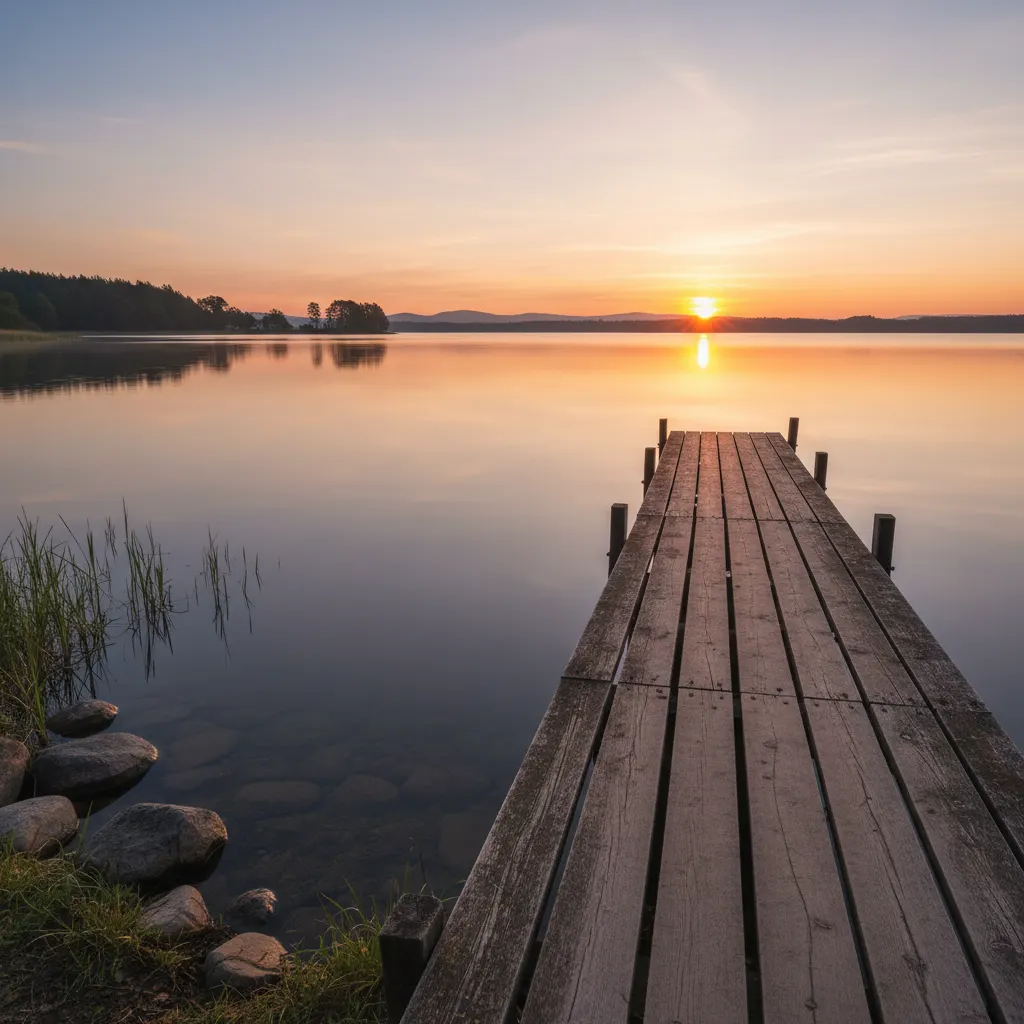
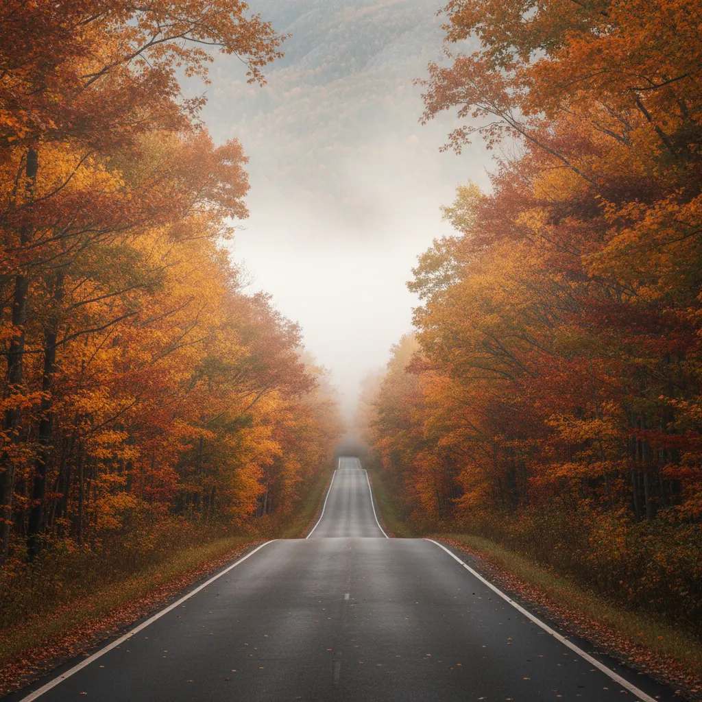
Leading Lines
Lines within your scene naturally guide the viewer’s eye through the image. Roads, rivers, fences, railway tracks, shadows, shorelines — any linear element can serve as a leading line.
Types of Leading Lines
- Converging lines that meet at a vanishing point create powerful depth. Think of train tracks disappearing into the distance.
- Diagonal lines add energy and dynamism. A winding path cutting diagonally across the frame feels more alive than a horizontal one.
- Curved lines (S-curves) are particularly elegant. A meandering river or a curving road draws the eye gently through the scene.
Where to Lead
Ideally, leading lines should guide the viewer toward your main subject or through the most interesting parts of the frame. A road that leads to nothing feels incomplete. A road that leads to a distant mountain gives the image purpose.
Framing
Use natural or architectural elements within the scene to frame your subject. This draws attention inward and adds depth to the image.
Common Frames
- Doorways and archways — Classic architectural frames that work for streets, landscapes, and portraits.
- Overhanging branches — Trees create natural organic frames, especially effective in landscape and travel photography.
- Windows — Shooting through a window frames the outside world and adds context about the viewer’s position.
- Tunnels and bridges — The enclosed structure focuses attention on whatever is visible at the end.
Tips for Effective Framing
The frame does not need to surround the entire subject. A partial frame — branches along the top and one side, for example — is often more natural than a complete border. Keep the frame element darker than the subject to avoid competing for attention.
Symmetry and Patterns
Humans are drawn to symmetry. Reflections in water, identical buildings flanking a street, the wings of a butterfly — symmetrical compositions feel satisfying and orderly.
Using Symmetry
- Center your subject when shooting symmetrical scenes. This is one situation where centered composition works better than the rule of thirds.
- Reflections in calm water, glass, or polished surfaces create instant symmetry. Get low to maximize the reflected area. For more on this technique, see our guide on how to photograph reflections creatively.
- Architecture is rich with symmetry — hallways, staircases, bridges, and building facades.
Patterns and Repetition
Repeating elements — rows of trees, identical windows, waves on a beach — create rhythm in an image. The pattern itself is visually engaging, but it becomes even stronger when one element breaks the pattern. A single red umbrella in a sea of black umbrellas. One open window among many closed ones. The break becomes the focal point.
Depth and Layers
A photograph is a two-dimensional representation of a three-dimensional world. Good composition creates the illusion of depth.
Foreground, Middle Ground, Background
Include elements at different distances from the camera. A rock in the foreground, a lake in the middle ground, and mountains in the background give the image three distinct layers, creating a sense of depth and scale.
Wide-angle lenses exaggerate the distance between near and far elements, making this technique even more effective. Get close to your foreground subject and let the scene unfold behind it.
Atmospheric Perspective
Haze, fog, and mist naturally create depth by making distant objects lighter and less contrasty. On a misty morning, layers of hills receding into the distance create beautiful depth without any compositional tricks. This effect is especially powerful during golden hour when warm light amplifies atmospheric layers.
Negative Space
Negative space is the empty area around your subject — an uncluttered sky, a blank wall, calm water. Rather than wasting space, it serves critical compositional purposes.
Why Negative Space Works
- It directs attention to the subject by eliminating distractions.
- It creates a sense of scale, especially when the subject is small within a vast environment.
- It evokes mood — loneliness, peace, freedom, vulnerability.
A small boat on a vast ocean. A lone figure against a massive wall. A bird in an empty sky. These images work because of what is absent, not just what is present. Street photographers use this concept extensively — learn more in our street photography tips and camera settings guide.
Balance
A well-composed image feels balanced — not necessarily symmetrical, but visually stable.
Visual Weight
Elements have “visual weight” based on their size, color, brightness, and complexity. A large dark object on the left side of the frame feels heavy. Balancing it with a smaller but brighter object on the right creates equilibrium.
Think of it like a seesaw: a large object close to the center can be balanced by a small object far from the center.
Filling the Frame
Sometimes the best composition eliminates everything except the subject itself. Move closer or zoom in until the subject fills the entire frame. This works especially well for portraits, textures, and details where the surroundings add nothing.
Robert Capa’s famous advice: “If your pictures aren’t good enough, you’re not close enough.” Getting closer forces intimacy and eliminates distractions.
Breaking the Rules
Every one of these rules can and should be broken when the image calls for it.
- Centering a subject creates power and confrontation. A symmetrical portrait staring directly into the camera is more intense than one placed on a thirds line.
- Placing a subject at the edge with no room to move into can create tension and unease. Silhouette photography is another powerful rule-breaking technique where you deliberately underexpose the subject for dramatic effect.
- An empty composition with the subject barely visible can evoke loneliness or insignificance.
- Chaotic compositions without clear lines or structure can express energy and confusion.
The key is intentionality. Break the rules because you have a reason — not because you did not know them. A centered subject should feel deliberate, not accidental.
How to Improve Your Composition
- Study photographs you admire. Analyze why they work. Where is the subject placed? What lines guide your eye? What was excluded from the frame?
- Shoot more than you need. Try three compositions of every scene — one following the rules, one breaking them, one experimental.
- Review your work critically. A week after a shoot, look at your images with fresh eyes. Which compositions hold up? Which feel awkward?
- Practice with your phone. Composition skills transfer across all cameras. Train your eye during daily life — the best camera is the one you have with you.
Composition is not about rigid formulas. It is about developing an intuition for what looks right. These rules are training wheels. Use them until you no longer need to think about them, and then trust your eye.
Recommended Camera Settings for Composition Practice
Good composition often requires specific technical choices. The settings below help you execute the composition techniques described in this guide with maximum impact.
| Composition Technique | Focal Length | Aperture | Why These Settings |
|---|---|---|---|
| Rule of thirds portrait | 85mm (e.g., Canon RF 85mm f/1.8 or Sony FE 85mm f/1.8 — see our best portrait lenses guide) | f/1.8–f/2.8 | Subject isolation, creamy bokeh separates subject from background |
| Leading lines landscape | 16–24mm (e.g., Tamron 17-28mm f/2.8) | f/8–f/11 | Deep depth of field keeps foreground lines and background sharp |
| Framing with architecture | 35–50mm | f/5.6–f/8 | Natural perspective, enough depth of field to keep frame and subject sharp |
| Symmetry and reflections | 24–35mm | f/8–f/11 | Wide enough to capture both halves, sharp across the frame |
| Negative space minimalism | 50–200mm | f/4–f/5.6 | Telephoto compresses the scene, moderate aperture keeps subject sharp |
| Pattern and repetition | 70–200mm (e.g., Nikon Z 70-200mm f/2.8) | f/5.6–f/8 | Telephoto flattens perspective, emphasizing repeating elements |
| Filling the frame | 100mm macro or 70–200mm zoom | f/2.8–f/4 | Gets close, shallow depth of field for detail shots |
A versatile two-lens kit for composition practice is a wide-angle zoom (16-35mm) and a short telephoto zoom (70-200mm). Together they cover every technique listed above.
Real-World Composition Tips from the Field
Work the scene before raising the camera. Walk around your subject. Look at it from the left, the right, above, and below. Professional landscape photographers often spend ten minutes studying a location before taking a single frame. The first angle you see is rarely the best one.
Use Live View or the electronic viewfinder for critical framing. An optical viewfinder only shows approximately 95 to 98 percent of the final frame on many DSLRs. Mirrorless cameras like the Sony A7C II or Fujifilm X-T5 show 100 percent of the frame in their electronic viewfinders, so what you see is exactly what you get. This matters when you are placing subjects precisely on thirds lines or balancing elements near the edges.
Shoot horizontal and vertical of the same scene. Many photographers default to horizontal orientation. Switching to vertical often reveals a stronger composition, especially for subjects with strong vertical lines — trees, buildings, standing figures. Take both and compare later.
Use a prime lens to learn composition faster. A fixed focal length like a 35mm or 50mm forces you to move your feet to compose. You cannot zoom your way to a better angle, so you physically engage with the scene. This builds spatial awareness far faster than shooting with a zoom lens. The Nikon Z 40mm f/2 and Canon RF 50mm f/1.8 are both affordable options that reward this approach.
Check the edges of your frame. Before pressing the shutter, scan the borders of the viewfinder. Look for distracting elements creeping in — a branch tip, a trash can, a person’s elbow. Moving half a step in any direction often removes these distractions without affecting the main composition.
Common Mistakes to Avoid
Centering everything by default. The instinct to place the subject dead center is strong, especially for beginners. Center placement works for symmetrical scenes and direct-address portraits, but for most other subjects it produces static, uninteresting images. Practice placing subjects off-center until it feels natural.
Tilting the horizon unintentionally. A slightly crooked horizon is one of the most common amateur mistakes and one of the easiest to spot. Use the in-camera level (most modern cameras have one in the viewfinder) or enable the grid overlay. A one-degree tilt is enough to make a landscape feel wrong.
Including too many competing subjects. A frame with three equally interesting elements and no clear hierarchy confuses the viewer. Every strong composition has one primary subject. Supporting elements should lead to it or complement it, not compete with it.
Ignoring the background. A beautiful subject in front of a cluttered, distracting background loses its impact. Before shooting, look behind your subject. A slight change in angle or a wider aperture can transform a busy background into a clean one.
Applying rules mechanically without considering the subject. Placing a subject on a thirds intersection does not automatically make a good photo. The rule of thirds is a guideline, not a guarantee. Always ask whether the placement serves the story you want to tell. Sometimes a centered subject or an edge placement communicates more effectively.
Frequently Asked Questions
What is the most important composition rule for beginners to learn first? The rule of thirds is the best starting point because it applies to virtually every genre of photography and immediately improves the visual balance of your images. Enable the grid overlay on your camera and practice placing subjects at the intersection points for two weeks. Once the rule of thirds becomes instinctive, move on to leading lines and negative space.
Do professional photographers actually think about composition rules while shooting? Most professionals have internalized the rules so deeply that they apply them instinctively rather than consciously. A wedding photographer does not pause to calculate thirds lines — years of practice have trained their eye to find strong compositions automatically. The rules serve as a learning framework. Once absorbed through thousands of hours of shooting, they become intuition.
How do I know when to break a composition rule? Break a rule when doing so serves a clear creative purpose. If centering a subject creates the confrontational intensity you want, center it. If placing a subject at the very edge of the frame communicates isolation, do it. The test is intentionality: can you explain why breaking the rule makes the image stronger? If yes, break it confidently. If you are breaking it because you did not notice, that is a mistake, not a creative choice.
You might also like

How to Shoot Silhouettes: A Step-by-Step Guide
Master silhouette photography with backlighting techniques, exposure metering tips, subject selection, and creative composition ideas.

How to Photograph Reflections Creatively
Discover techniques for capturing stunning reflections in water, glass, and puddles, plus how polarizing filters give you creative control.

Food Photography Tips for Beginners
Learn essential food photography techniques including lighting setups, angles, styling, props, and editing to make your food shots stand out.